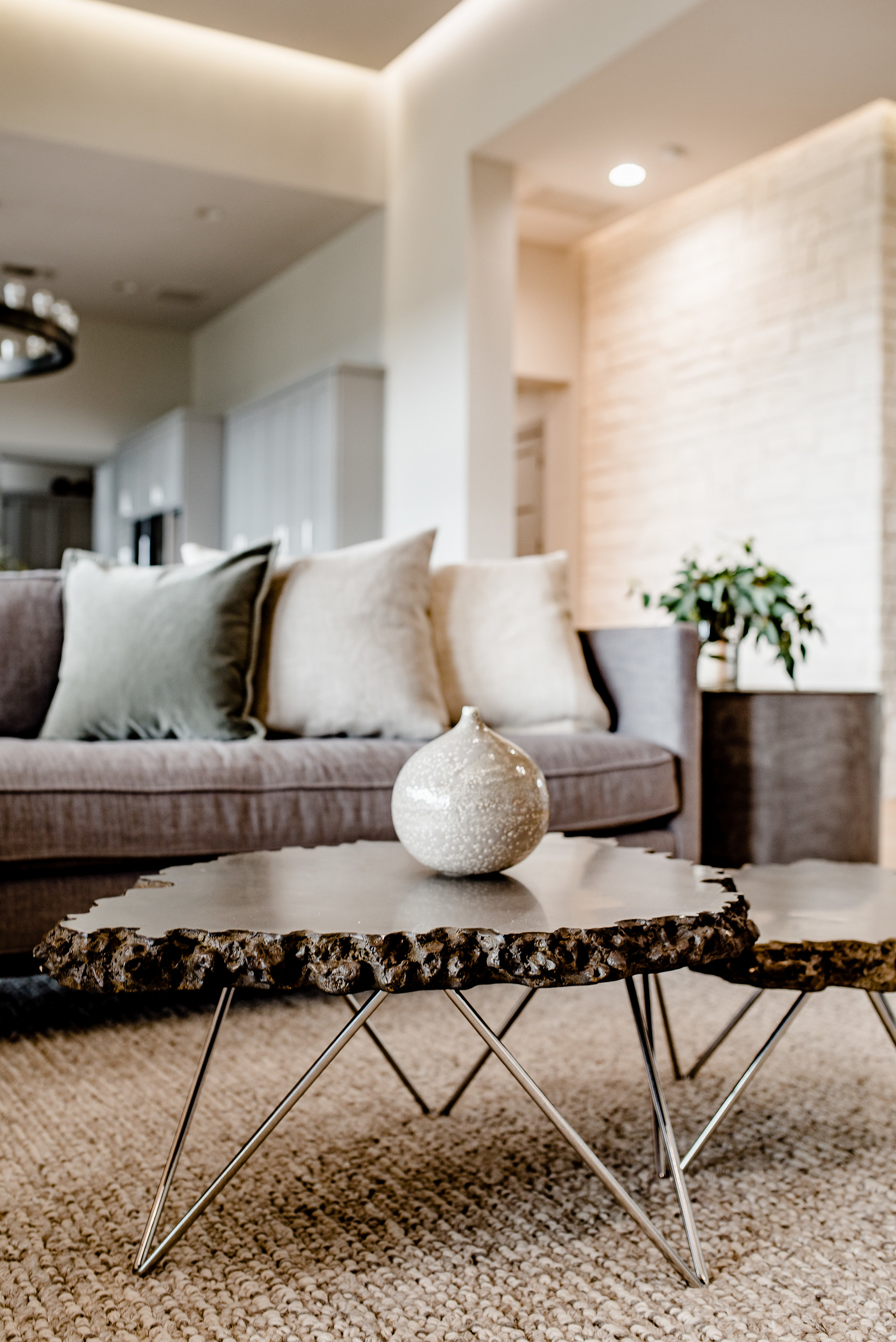
Metal Finish Finesse

6061358C-75F3-41EC-8FF1-B147FB666E06.JPG

THE END OF MATCHY-MATCHY

It’s happened a few times. A client says ‘I want everything to MATCH’. I respectfully say ‘Hmm. We are not going to do that, but I promise it will be beautiful and everything will COORDINATE’. The client looks confused, and I can tell in that moment he’s not sure about me. I remind myself that in time he'll gain trust, and the proof will be in the end result. 

So let’s dig a little deeper. A safe interior ‘matches’. A room from Rooms to Go ‘MATCHES’. What you want is something that feels rich, stylish, and well done; a thoughtful and elevated interior reflecting quality and your personality for years to come.

LET ME EXPLAIN...

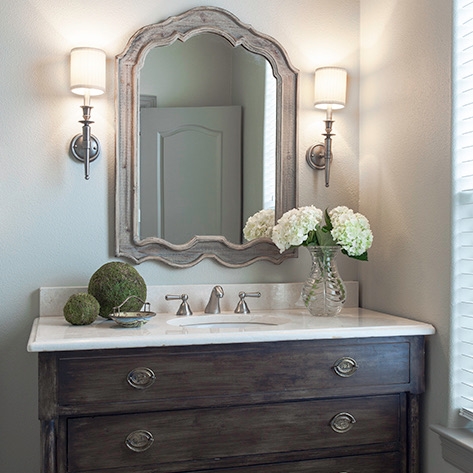
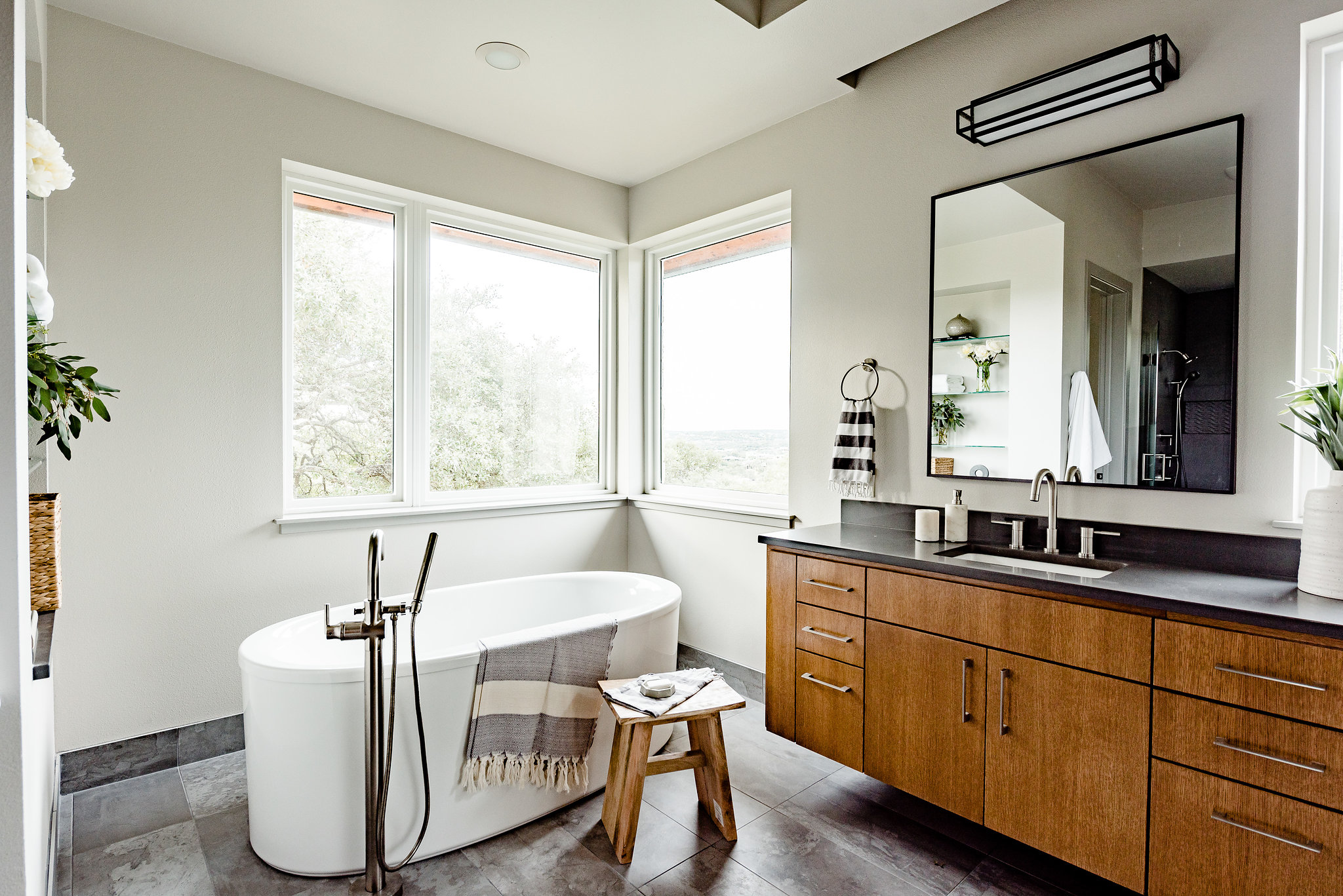
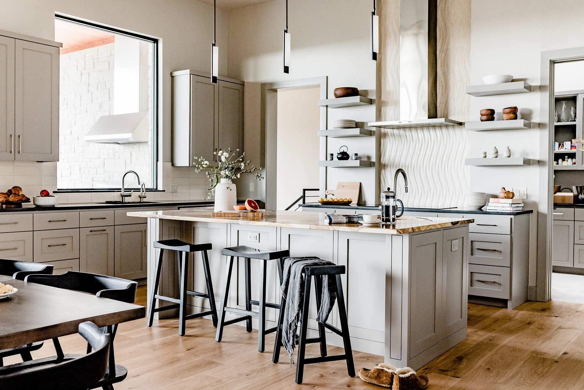
So here is a strategy I follow regarding metal finishes. First, I choose a primary finish. This is implemented throughout the architecture of the home (areas such as door hardware, hinges, stair railings, or windows, just to name a few possibilities). Next, I select a secondary finish. This might show up in select light fixtures, cabinet & drapery hardware, and maybe some decorative accents. Lastly, I like to have fun in a few individual spaces, such as powder rooms and bathrooms. Here I might mix it up a little. There will still be a primary metal finish, but it can be different from the rest of the house. Sound weird? It’s not. It prevents that moment of “Oh crap – polished brass is out of style now and I have to replace everything in my house!”. It’s subtle, intentional, and slightly unexpected. Something you really won’t see me do is pair one silver metal with another (for example, chromes with nickels), or one dark metal with another (for example, blacks with bronze). While I know I am abandoning SOME rules - a designer has to have some guidelines! (Haha)

IN REAL LIFE

Now see how our strategy plays out in two case studies below. In each project we used at least 2 or 3 different metal finishes in various areas of the house...

CASE STUDY ONE: In the traditional project below our primary metal finish was antique nickel. It was selected for doorknobs, most light fixtures, and plumbing and hardware. Our accent finish was black, which you can see in the ceiling fan, furniture accents, stair rail, and entry door. Finally, in select bathrooms we went with chrome. It's a perfect finish to pair with marble.

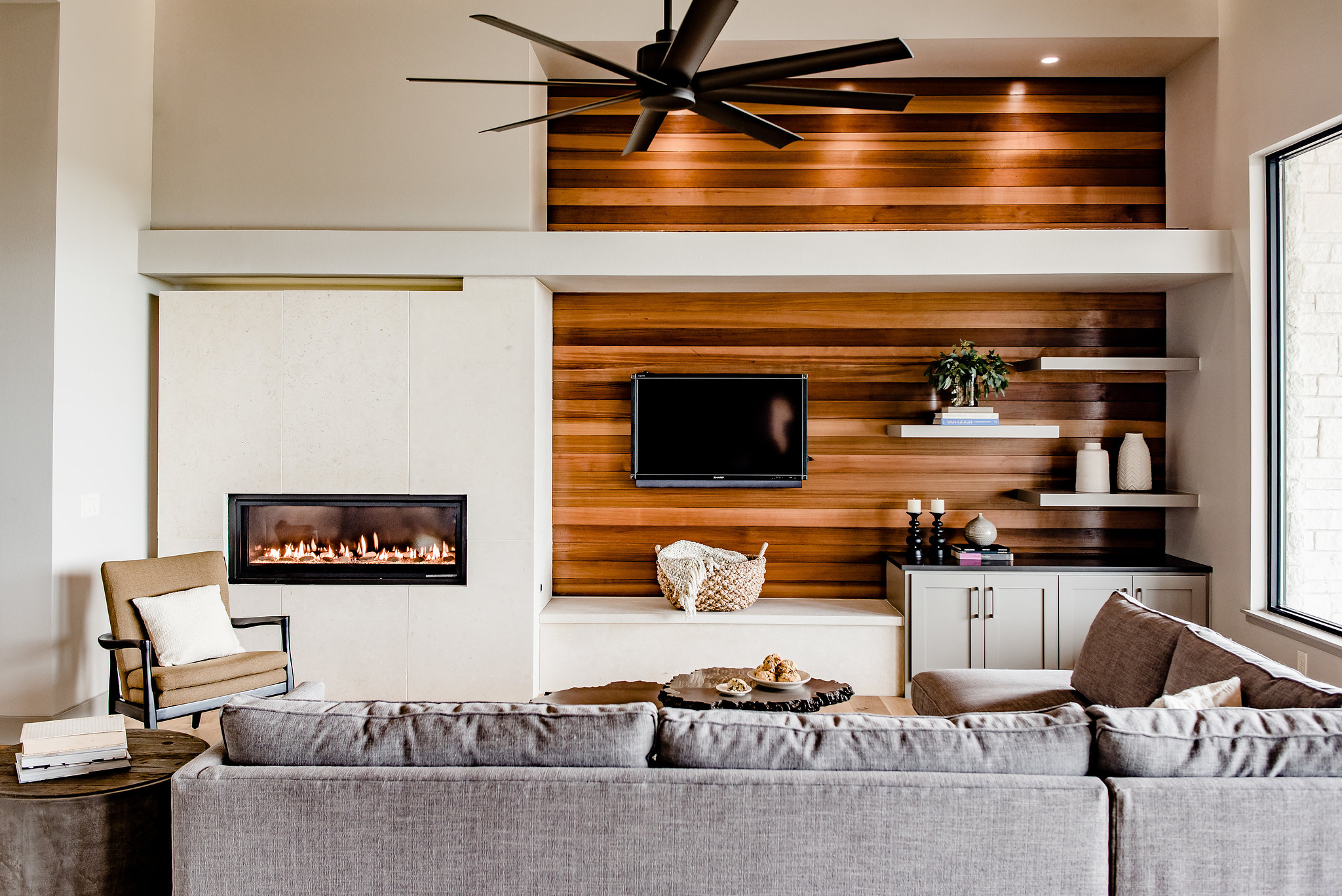
CASE STUDY TWO: In this contemporary home we mixed oil-rubbed bronze (light fixtures, door hardware, windows, and stair railings) with touches of satin nickel (plumbing, cabinet hardware, and furniture accents). The result is a fresh and light interior that remains warm and anchored to nature.

Pretty easy huh? Now go forth and mix metals with confidence. You can DO this blog friends!

Lessons from Experience - Design Mistakes to Avoid in 2018

Remodel with confidence in 2018! (Photo courtesy of Getty Images)

Remodel with confidence in 2018! (Photo courtesy of Getty Images)

At a recent peer gathering I threw out the question “what are some lessons learned and project stories you can share”, and the answers were wild! They included strange pet mishaps, a veggie stocked fridge that stunk up a remodel, and a glass chandelier that almost came crashing down during a simple furniture install. In 14 years of being a designer I've had my fair share of "learning experiences" as well. I’m all about learning from my mistakes, but what better than to learn from OTHER people’s mistakes?  Now take this knowledge and tackle your next remodel with confidence. You're welcome blog followers!

The list is based on stories from clients, peers, and a few first-hand situations. Here goes:

1) Check all dimensions closely when ordering anything, but especially furniture. That includes wall dimensions, ceiling heights, even door widths! I have a designer friend who once ordered sofas for a commercial space and they were too big to get through the doors! She now has some fabulous large sofas in her living room...

2) Read the fine print when placing orders, and document decisions clearly. An associate of mine once selected a sectional fabric, and gave the swatch to the vendor without writing the item number down. When it arrived weeks later, it was the wrong color. She had approved the order trusting that the vendor had documented it properly. It was an expensive assumption!

3) Always do a large paint sample before painting the entire area. Review it in the exact environment where it will be, and document your choices clearly. The first time I ever cried on a job site was when I arrived to see a sample of my sassy green accent paint, only to discover it was almost neon and they had painted it on EVERY WALL!

4) Inspect materials before they get installed. For example – open boxes of tile to make sure what is in the box is what you expected. Natural materials in particular (travertine, marble, etc.) can vary greatly from the sample.

5) On that same note, evaluate multiple samples of natural materials. For example, when ordering tile, make sure you examine at least 4 or 5 different tiles, and try to see a picture of the material installed. I had a client who carried one piece of travertine to every showroom for months. She compared everything to it, only to discover it represented only the very lightest of the color range. Variation is to be expected – be prepared to embrace it.

6) Review large swatches of all fabrics, finishes, and rugs before placing orders. A client told me of a time (she was working with a previous designer - thank goodness) when she had ordered fabric for drapes from a small swatch, only to realize after the drapes were installed that there were little monkeys on the print! Yes, that’s right - MONKEYS!

7) Make sure you see plumbing & light fixtures in person before ordering. I’ve seen sneaky details show up in person that were not visible in online pictures.

8) Inspect items when they are received and don’t sign off without noting even the smallest issues. If an item is delivered to you with a defect, you’ll have very little recourse if you don’t note it upon receipt.

9) Scale is important in general, but especially with regards to lighting. This includes everything from bedside lamps to sconces and chandeliers. If in question, create mock ups of the size with boxes or cardboard to get a better feel for it. I've had pretend fixtures hung with string for weeks while we evaluate if we like it from every angle (keepin' it classy Austin!)

10) Grout color is surprisingly important, and not easily changed. I typically choose a color that will either disappear or contrast to accentuate the pattern. Either way, I’m intentional about it. If there’s any question, have the tile installer make a sample board showing the tile with the grout.

These are just a few tips toward smarter design in 2018. I have often said "can just ONE day go by where I don't have to learn something?". Well maybe now you'll have 10 days.

Happy New Year everyone!


The Pursuit of Timeless Design

This project of ours was completed in 2009 and is still one of our favorites!  Photo by Chip Pankey.

This project of ours was completed in 2009 and is still one of our favorites!  Photo by Chip Pankey.

If you follow style trends you know the routine: concepts enter the scene, there are early adopters, and over time they become mainstream. Soon anyone who is building, remodeling, or decorating is selecting similar items (after all, it's the products and colors being offered by all the vendors!). Recently I've noticed the curve is even more aggressive. Social media propagates style tendencies at a fast and furious pace. As a designer, I see trends early and I tire of them fast. For this reason, I am on a mission to provide timeless design; to find unique solutions that feel current, but also elevated. There is no off-the-shelf recipe for how to accomplish this. If there were it would be achieved more frequently. It's a skill that separates great design from good design. It's a subtlety recognized by mature design lovers and achieved by only the most talented. It's a quality that is not easily described with words, but when it's right, you just know it.

Having said that, there are certainly some strategies you can follow in pursuit of a timeless interior. Here are a few of them:

1.Take your time. Ever bought a whole room all at once? Yah, me too – in college. It's a surefire way to a one-dimensional space, and you’ll tire of it fast. The idea is propagated by stores like Rooms to Go and IKEA, who advertise ‘easy design’. Don't get me wrong – these stores have their market. They simplify the process of buying furniture for people who want to get it over with fast or economically, but this is not a path to an elevated space. Fine design is curated and takes time.

2. Incorporate one or two unique pieces. Include something special that speaks to you, like an old family chair, or an antique rug or mirror. Yes – even in a contemporary space. You just have to go about it carefully and selectively. Doing so will add richness and keep it personal and interesting. It’s a direct expression of you and your family, and no one else will have your exact solution.

This antique rug in our Spicewood Contemporary project adds warmth and character in an otherwise stark white kitchen. Photo by An Indoor Lady.

This antique rug in our Spicewood Contemporary project adds warmth and character in an otherwise stark white kitchen. Photo by An Indoor Lady.

3. Selectively Splurge. Whether you are building, remodeling, or just refining your home over time, choose an area to stretch your budget and introduce a high-end element. It can be a lamp, a sculpture, anything. I have a thing for tile, and when remodeling our kitchen awhile back I fell in love with a beautiful backsplash tile from Walker Zanger. It seemed like a hefty price tag at the time, but I only needed 18 sqft.! And the results were well worth it. Now it adds a special touch to our kitchen, and each morning when I’m sipping my coffee it makes me smile. Priceless!

This is my Walker Zanger backsplash. I love it so much! Photo by An Indoor Lady.

This is my Walker Zanger backsplash. I love it so much! Photo by An Indoor Lady.

4. Learn from history. In particular I like to look back to classic interiors from design icons, furniture designers, and legendary architects. Here’s an example: recently I was discussing the use of marble and brass with a client. She said to me "I think of the federal buildings - if it was good enough for past presidents it is good enough for me!". Shortly after that I was in D.C. and paid special attention to the details in those buildings. She was right! Materials and finishes will go through cycles of popularity, but if a strategy has been used for many years it is likely a timeless one. Finding inspiration from historically good design is a way to avoid short term trends. 

This marble and brass staircase in the Supreme Court Building is a stunning example of timeless design. Photo courtesy of Getty Images.

This marble and brass staircase in the Supreme Court Building is a stunning example of timeless design. Photo courtesy of Getty Images.

5. Faux is just that : false. Ever seen something fake that you liked as good as the original? Me neither. Good design is real and purposeful, and it doesn’t have to pretend to be something it’s not. The “architecture snob” in me comes out when I see a column supporting nothing, or a painted sheetrock wall pretending to be plaster. Please don’t do it! I had an old friend from architecture school who would cringe at this stuff. He would joke about fake shutters tacked on suburban homes, and corbels that were purely for decoration. Whenever I comment on such things my husband says “you sound like Andy”, and I say “well… he was right”.

6. Nature never goes out of style - incorporating natural textures such as wood and stone adds richness to an interior. For a timeless approach, try finding slabs and materials that are less commonly used. Also, anywhere a view can be appreciated - play that up. A touch of nature elevates any space.

These slabs of Red Onyx, used by architect Mies Van Der Rohe in the Barcelona Pavilion in 1929, are a gorgeous example of nature in design.

These slabs of Red Onyx, used by architect Mies Van Der Rohe in the Barcelona Pavilion in 1929, are a gorgeous example of nature in design.

7. If everyone has it maybe you shouldn't. Enough said.

8. A little goes a long way when it comes to color. The color fad cycle is even tighter than that of materials, finishes, and furniture. I’ll admit that if you look at our LBI interiors you might conclude we’re pretty neutral. It’s not out of fear to be bold – it’s an awareness that in pursuit of timeless design it’s a decision you’ll regret faster than any other. Tile, cabinets, expensive furnishings – these features have a cost attached that make them less inclined to be swapped out often, so you’d better like them for the long haul. Paint, pillows, art – these are much easier to change, and for that reason I am more inclined to embrace color in these areas.

9. Most importantly - choose things because YOU love them, not because they are in style. Let's remember that the ultimate goal of "timelessness" is having a home you will love for years to come. If you stay true to who you are, then your choices will continue to reflect your personality regardless of what everyone else is doing.

In summary, style trends will come and go. When it comes to your home, pursue quality first, then lean toward personal expression rather than popular fads for an interior that will stand the test of time.